Eharmony reveal his new visual identity

In a world where first impressions are increasingly digital, eHarmony has joined the wave of dating apps revamping their look to keep up with changing times and tastes. This move signifies more than a mere facelift; it’s a step towards meeting the evolving needs of singles in a post-pandemic era.
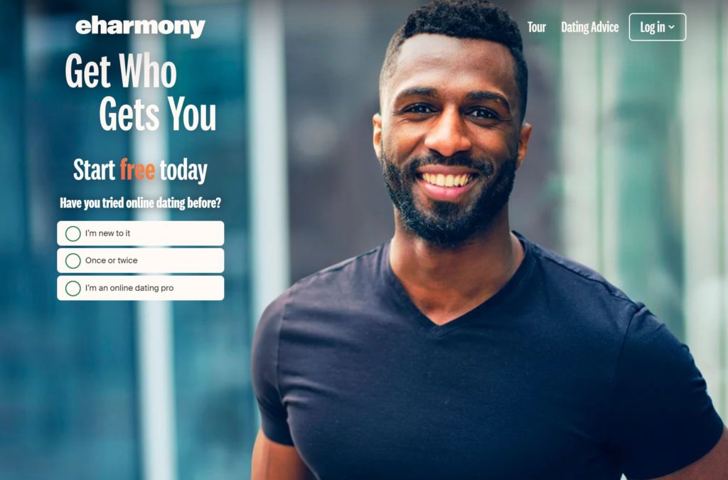
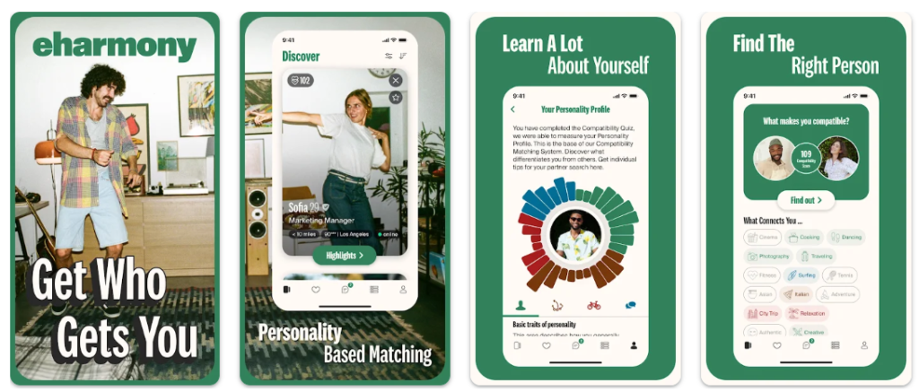
Recently, eHarmony unveiled a refreshed visual identity, marking a new chapter in its journey. The updated design features a contemporary wordmark, a modern color palette, and a minimalist icon. This redesign isn’t just about aesthetics; it’s a strategic move to enhance user experience and attract a broader audience of singles. eHarmony’s statement highlights their commitment to innovation and fostering enduring connections, indicating a deep understanding of their users’ desires for meaningful relationships.
eHarmony is not alone in this endeavor. Other major players like Tinder have also reimagined their designs. The common thread in these redesigns is a shift towards modernity and minimalism, using fewer colors and cleaner lines. This trend reflects a broader industry recognition that post-pandemic singles are seeking a change. A fresh, user-friendly interface can play a crucial role in keeping users engaged with the service they started with, rather than switching to competitors.
One of the key motivations behind these redesigns is the need to appeal to new user demographics, particularly Gen Z singles under 30. This demographic tends to favor modern, minimalist designs that are not just visually appealing but also intuitive to use. By updating their interfaces, dating apps are positioning themselves to be more relevant and attractive to younger users who are entering the dating scene with fresh expectations.